The mission of this project was to create a series of three icons for a hardware store that are intended to be used as a form of wayfinding for both in-store signage as well as online categories.

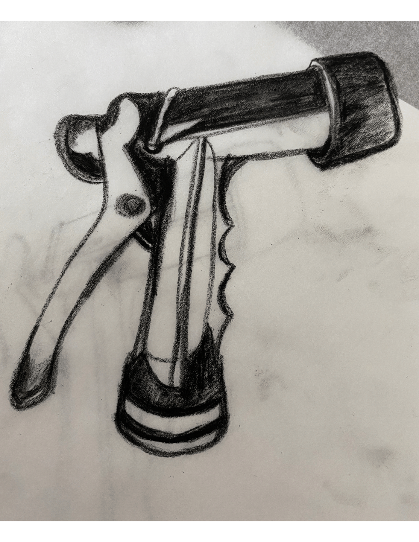
Through a series of photographs, I selected the top three of each object that best showed the highlights and shadows of the object's unique shape and contour.


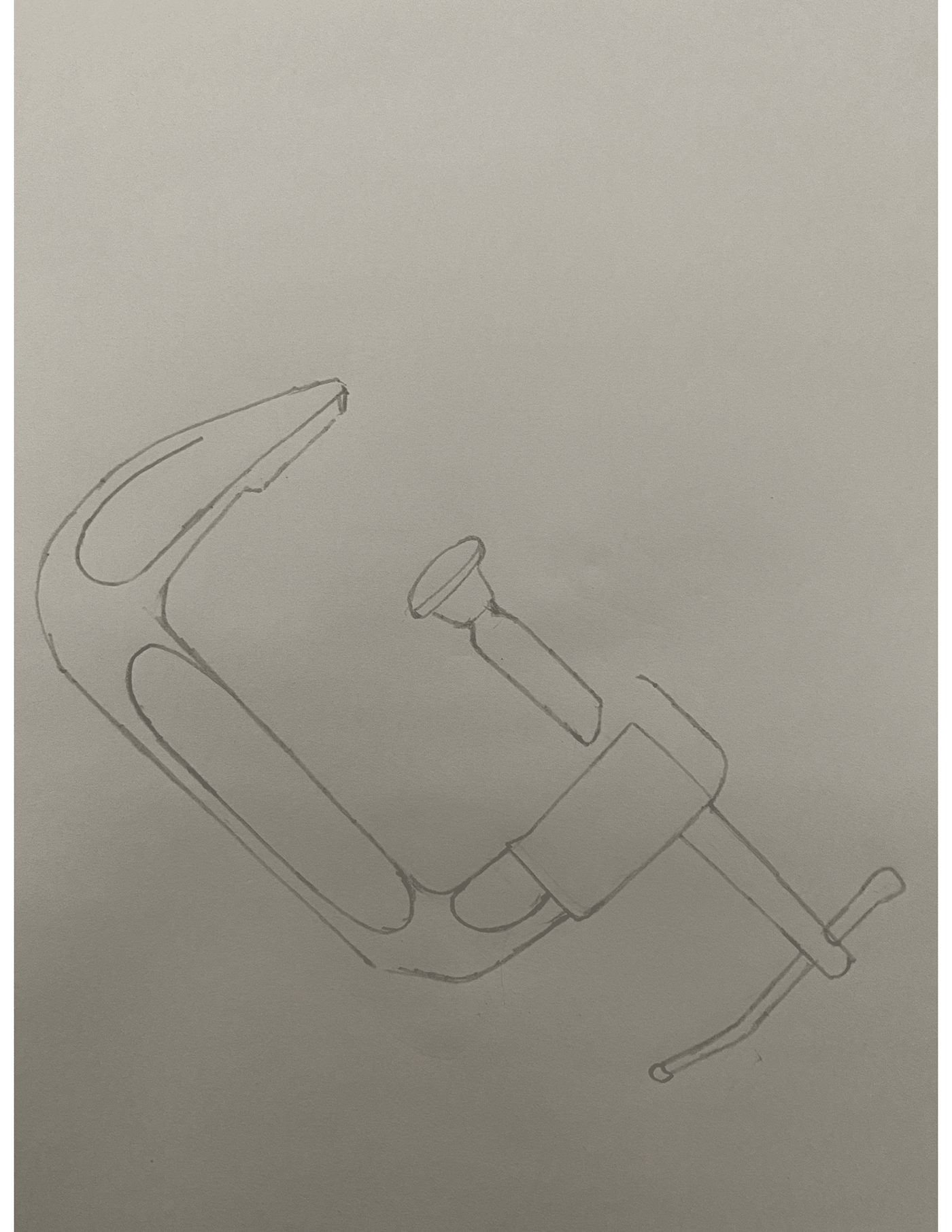


Using the high contrasted photographs as reference, I converted my rough pencil sketches to a contrasted drawing, emphasizing on any and all highlights of the object using charcoal and pencil.


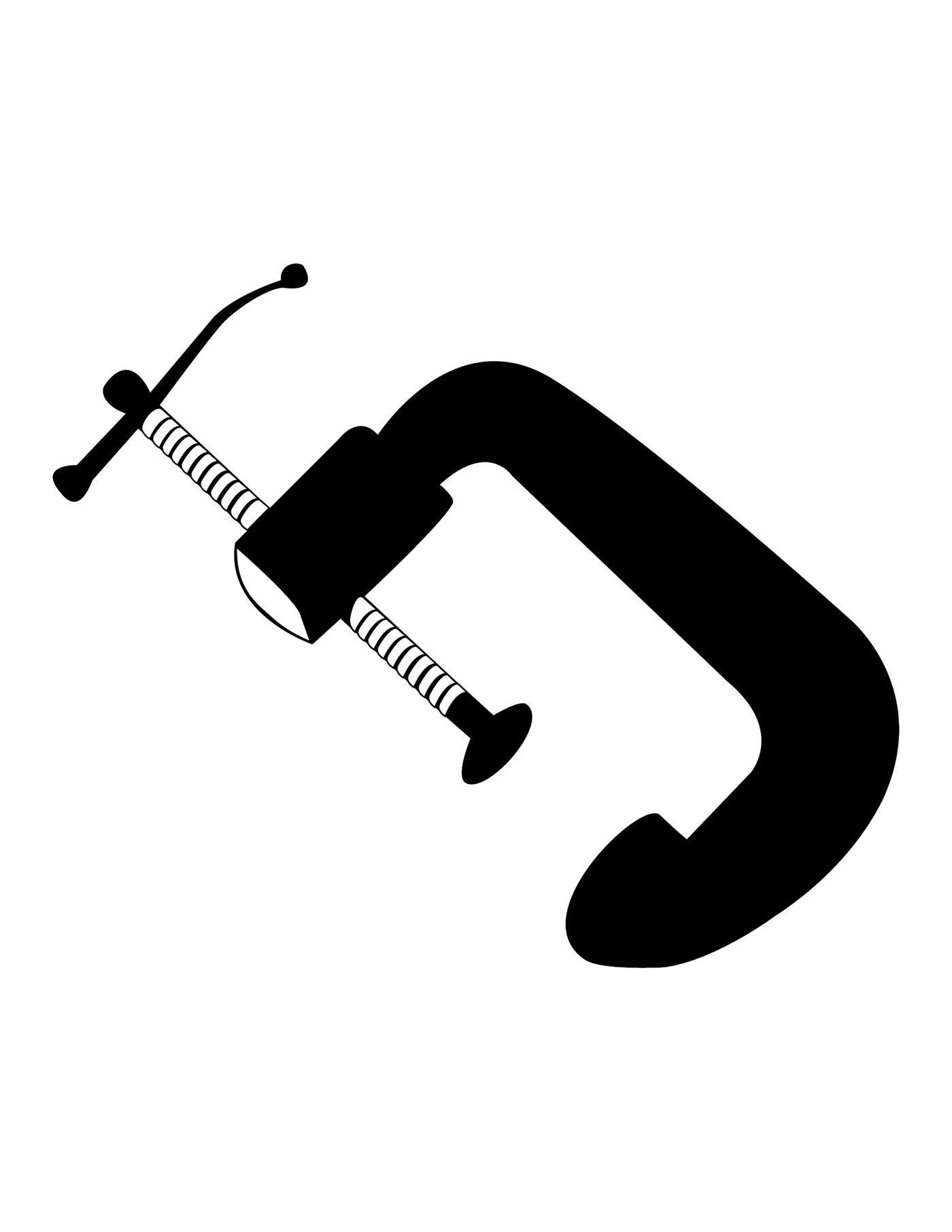
Though the first stages of the iteration process, I began with digitally applying as much detail as possible, slowly working towards simplification by eliminating any unnecessary detail that would not read at small scale.


Once the simplification of the objects felt appropriate, I began the process of exploring several typefaces by applying and arranging them with the object to see what typeface would pari well with the objects unique shape and contour.

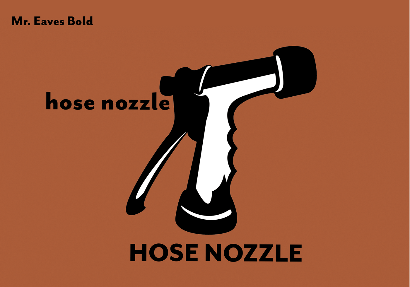
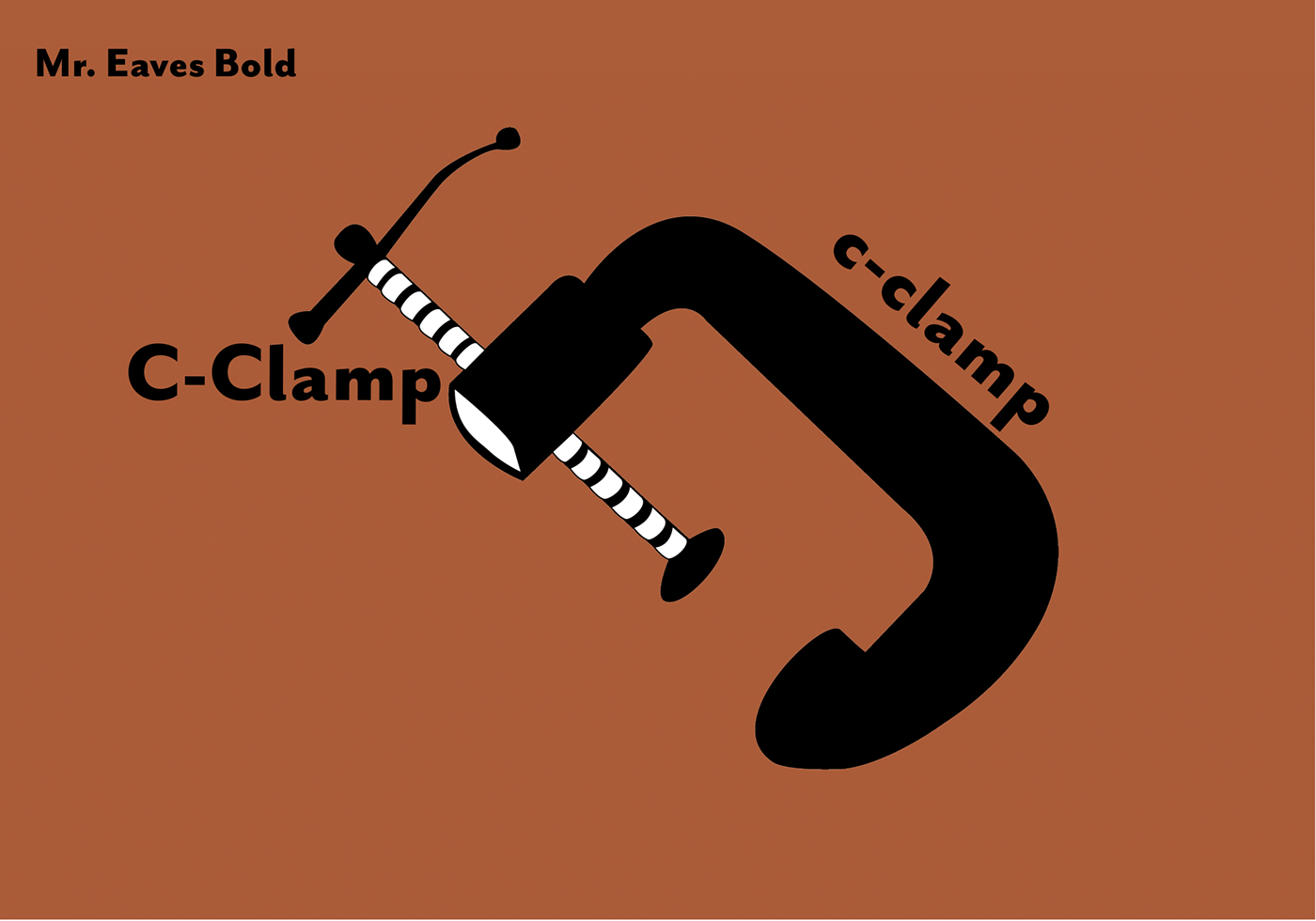


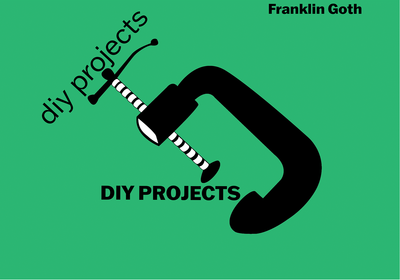


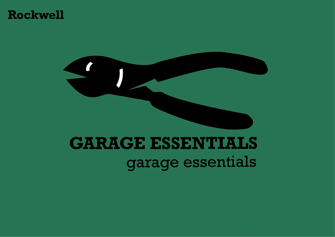
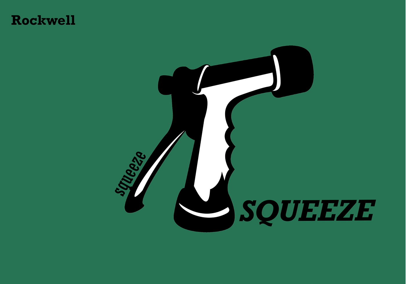

I found the Franklin Goth typeface paired well with all three objects. I continued to develop the sign compositions by exploring the relationships between words and the final icons.

Following several iterations of the icons, I selected the top 3 final designs that I felt not only best represented the objects, but could also be used as a great and friendly way finding signage for any hardware store.


